Nocturne for WPF
Nocturne is a dark theme for WPF on .NET 10 and later. The Windows 11 backdrop (Acrylic by default, or Mica / Mica Alt) shows through a tinted window with a soft light from the top-left corner, and cards and controls sit on top as light, translucent surfaces. One resource dictionary styles every standard control; the package adds the controls a desktop app usually needs on top.
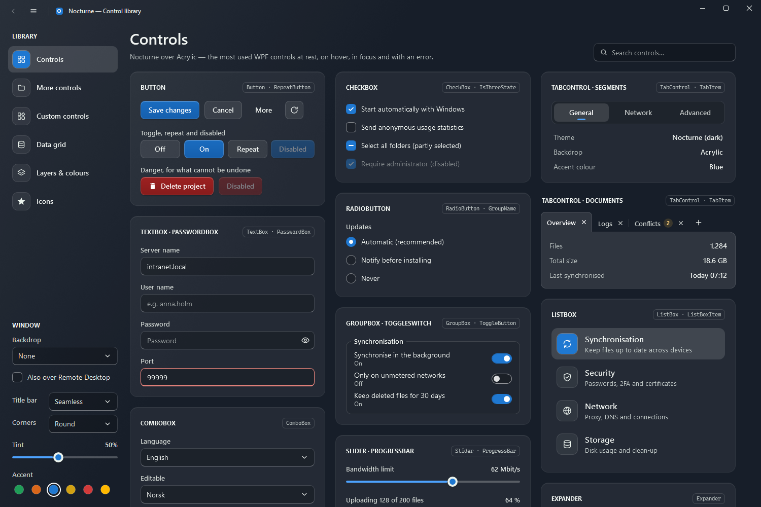
| Package | Nocturne.Wpf on nuget.org (and on each GitHub release) |
| Needs | .NET 10 or later, Windows 10 or 11. The backdrop needs Windows 11 22H2 with transparency effects on; elsewhere the window paints an opaque ground of the same colour. |
| Namespace | xmlns:nc="urn:nocturne-wpf" |
| Start with | Getting started |
What is in it
- The window.
NocturneWindowdraws the backdrop, the tint and the light, its own 44px title bar (with commands on both sides, and a separated or accent-tinted strip if you like) and caption buttons, and hosts dialogs and flyouts. - Every standard control, styled as soon as
Nocturne.xamlis merged, plus named variants such asNocturne.Styles.Button.Primary,.DangerorNocturne.Styles.TabControl.Document. Text fields get a right-click menu with icons, errors show in a callout under the field, and scroll bars fade out while the mouse is away. - Own controls (
nc:namespace):DropDownButton,SplitButton,Tile,Badged,NumericUpDown,TimePicker,ColorPicker,AutoSuggestBox,SearchComboBox,RangeSlider,Rating,ProgressRing,BusyIndicator,InfoBar,Accordion,HamburgerMenu,NocturneDialog,FlyoutandNocturneGrid, a data grid for large lists with search, header filters, grouping and paging. - Accents. Blue by default;
NocturneTheme.SetAccentswitches to green, orange, yellow, red or the accent colour chosen in Windows, at run time. See Theme and accents. - Building blocks: cards, tags, pills, badges, icon tiles, a type scale, a small set of line icons (
nc:StrokeIcon) and Material Design Icons (nc:NocturneIcon,{nc:Icon Bell}). See Typography and surfaces.
The pages
| Page | What it covers |
|---|---|
| Getting started | Install, merge the dictionary, the first window |
| Theme and accents | Backdrop, tint, light, accents, overriding brushes, the font |
| Controls | One page per group of controls, each with a picture and XAML |
| Sample apps | Two applications built with the theme, page by page |
| Reference | Resource keys and helpers (attached properties, template parts) |
The pictures come from the demo app in src/Nocturne.Wpf.Demo (--snapshot); the one under each control’s heading is rendered from its gallery, with drop-downs and menus open where the control has one. They show the opaque fallback ground, as a snapshot cannot see the Windows backdrop.
License
MIT, except the Material Design Icons that NocturneIcon draws (Apache License 2.0, by Pictogrammers; see NOTICE.md). The rest, including the line icons, is drawn for Nocturne; the font is Segoe UI, which comes with Windows. The package’s licence is MIT AND Apache-2.0.