Buttons
Button
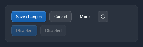
Every Button is a light translucent surface with a 1px border and 8px corners; hover lightens it (120 ms) and a disabled button fades. The variants are keyed styles:
| Style | Look |
|---|---|
(implicit) / Nocturne.Styles.Button | Light surface, for most actions |
Nocturne.Styles.Button.Primary | The accent with a light top edge and a small shadow; one per view, for the main action |
Nocturne.Styles.Button.Danger | A deep red, darker than the red accent, for actions that cannot be undone (delete) |
Nocturne.Styles.Button.Subtle | No surface until hovered; for less important actions |
Nocturne.Styles.Button.Icon | A 36×36 square for an icon |
Nocturne.Styles.Button.Icon.Subtle | An icon button with no surface until hovered (tool bars, title bar) |
<Button Style="{StaticResource Nocturne.Styles.Button.Primary}" Content="Save changes" IsDefault="True" />
<Button Content="Cancel" IsCancel="True" />
<Button Style="{StaticResource Nocturne.Styles.Button.Subtle}" Content="More" />
<Button Style="{StaticResource Nocturne.Styles.Button.Icon}" ToolTip="Refresh" AutomationProperties.Name="Refresh">
    <nc:StrokeIcon Width="18" Height="18" Data="{StaticResource Nocturne.Icons.Refresh}" />
</Button>
Danger

Nocturne.Styles.Button.Danger is for deleting and other actions that cannot be undone, usually next to a Cancel button or as the main button of a confirmation dialog (NocturneDialog.AffirmativeButtonStyle). Its red is deeper than the red accent, so it stands apart from the accent in every colour.
<Button Style="{StaticResource Nocturne.Styles.Button.Danger}">
    <StackPanel Orientation="Horizontal">
        <nc:NocturneIcon Kind="Delete" Width="16" Height="16" Margin="0,0,8,0" />
        <TextBlock Text="Delete employee" />
    </StackPanel>
</Button>
The template reads its colours from ControlHelper, so a button in another colour is a style with a few setters:
<Style x:Key="WarningButton" TargetType="Button" BasedOn="{StaticResource Nocturne.Styles.Button}">
    <Setter Property="Foreground" Value="#FF2A1F05" />
    <Setter Property="Background" Value="{DynamicResource Nocturne.Brushes.Warning}" />
    <Setter Property="nc:ControlHelper.HoverBackground" Value="#FFFFDE9A" />
    <Setter Property="nc:ControlHelper.PressedBackground" Value="#FFE8BC5E" />
</Style>
ToggleButton and RepeatButton
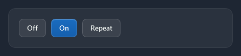
A checked ToggleButton takes the accent. RepeatButton looks like a Button.
<ToggleButton Content="Details" IsChecked="True" />
<RepeatButton Content="Repeat" Delay="400" Interval="80" />
For an on/off setting, use the toggle switch instead.
Hyperlink

Links are drawn in the light accent (Nocturne.Brushes.Accent.Text), underlined under the mouse.
<TextBlock><Hyperlink NavigateUri="https://example.com" RequestNavigate="OnNavigate">Open the release notes</Hyperlink></TextBlock>
DropDownButton
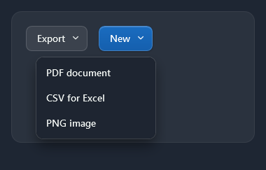
nc:DropDownButton opens its Menu (a ContextMenu) under itself; a chevron follows the content. Nocturne.Styles.DropDownButton.Primary is the accent version.
<nc:DropDownButton Content="Export">
    <nc:DropDownButton.Menu>
        <ContextMenu>
            <MenuItem Header="PDF document" Click="OnExportPdf" />
            <MenuItem Header="CSV for Excel" Click="OnExportCsv" />
        </ContextMenu>
    </nc:DropDownButton.Menu>
</nc:DropDownButton>
SplitButton
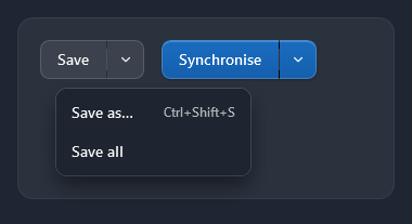
nc:SplitButton is a button with a chevron part: the left part is an ordinary button (Click, Command), the chevron opens Menu with the other choices. Nocturne.Styles.SplitButton.Primary is the accent version.
<nc:SplitButton Content="Save" Click="OnSave">
    <nc:SplitButton.Menu>
        <ContextMenu>
            <MenuItem Header="Save as…" InputGestureText="Ctrl+Shift+S" />
            <MenuItem Header="Save all" />
        </ContextMenu>
    </nc:SplitButton.Menu>
</nc:SplitButton>
Tile
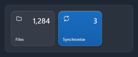
nc:Tile is a large button for a dashboard: an icon (the content) at the top left, a Count at the top right and a Title at the bottom. Nocturne.Styles.Tile.Accent fills it with the accent.
<nc:Tile Width="150" Title="Files" Count="1,284" Command="{Binding OpenFiles}">
    <nc:StrokeIcon Width="24" Height="24" Data="{StaticResource Nocturne.Icons.Folder}" />
</nc:Tile>
Badged
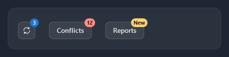
nc:Badged puts a small badge on the top-right corner of its content. The badge is hidden while Badge is null.
<nc:Badged Badge="{Binding UnreadCount}">
    <Button Style="{StaticResource Nocturne.Styles.Button.Icon}" ToolTip="Messages">
        <nc:StrokeIcon Width="18" Height="18" Data="{StaticResource Nocturne.Icons.Sync}" />
    </Button>
</nc:Badged>
<nc:Badged Badge="12" BadgeBackground="{DynamicResource Nocturne.Brushes.Error}" BadgeForeground="#FF2A0E0B">
    <Button Content="Conflicts" />
</nc:Badged>
| Property | |
|---|---|
Badge | What the badge shows (a number or a short word) |
BadgeBackground | The badge’s fill (the accent by default) |
BadgeForeground | The badge’s text colour (the text on the accent by default) |
The badge sticks out 7px above and to the right of the content. In the 44px title bar a 36px button leaves only 4px above it, so there put the Badged around the button’s icon instead:
<nc:NocturneWindow.RightWindowCommands>
    <Button Style="{StaticResource Nocturne.Styles.Button.Icon.Subtle}" ToolTip="Notifications">
        <nc:Badged Badge="4" HorizontalAlignment="Center" VerticalAlignment="Center">
            <nc:NocturneIcon Kind="Bell" Width="18" Height="18" />
        </nc:Badged>
    </Button>
</nc:NocturneWindow.RightWindowCommands>