Typography and surfaces
Text styles
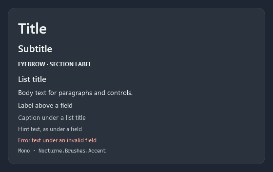
The type is Segoe UI at 14px for body text and controls. The text styles are keyed TextBlock styles; the sizes are resources, so a whole app can scale them.
| Style | Size / weight | For |
|---|---|---|
Nocturne.Styles.TextBlock.Title | 30 / SemiBold | Page titles |
Nocturne.Styles.TextBlock.Subtitle | 20 / SemiBold | Sections, dialog titles |
Nocturne.Styles.TextBlock.Eyebrow | 12 / Bold | Section labels above a group, written in capitals (as on cards) |
Nocturne.Styles.TextBlock.ListTitle | 16 / Medium | The first line of a list item |
Nocturne.Styles.TextBlock.Body | 14 | Paragraphs |
Nocturne.Styles.TextBlock.Label | 13 / Medium | Labels above fields |
Nocturne.Styles.TextBlock.Caption | 13, secondary colour | The second line of a list item, descriptions |
Nocturne.Styles.TextBlock.Hint | 12, hint colour | Help text under a field |
Nocturne.Styles.TextBlock.Error | 12, red | The message under an invalid field |
Nocturne.Styles.TextBlock.Mono | 11, monospaced | Codes, keys, values |
| Size key | |
|---|---|
Nocturne.Font.Size.Title | 30 |
Nocturne.Font.Size.Subtitle | 20 |
Nocturne.Font.Size.ListTitle | 16 |
Nocturne.Font.Size.Default | 14 |
Nocturne.Font.Size.Caption | 13 |
Nocturne.Font.Size.Small | 12 |
Nocturne.Font.Size.Tag | 11 |
The text colours are Nocturne.Brushes.Text (primary), .Secondary, .Label, .Hint and .Placeholder. To use another font, see Theme and accents.
Cards
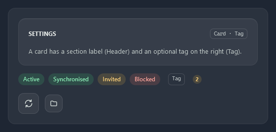
A card is the surface a group of controls sits on: Nocturne.Brushes.Surface1 with a 1px border, 14px corners and 20px padding. Nocturne.Styles.Card is a HeaderedContentControl with a section label (Header) and an optional tag on the right (Tag); Nocturne.Styles.Border.Card is the same surface as a plain Border.
<HeaderedContentControl Style="{StaticResource Nocturne.Styles.Card}" Header="SYNCHRONISATION" Tag="Beta">
    <StackPanel>...</StackPanel>
</HeaderedContentControl>

<Border Style="{StaticResource Nocturne.Styles.Border.Card}">...</Border>
Tags, pills and badges
All three are ContentControl styles.
| Style | |
|---|---|
Nocturne.Styles.Tag | A small outlined label in monospaced text, as on the cards |
Nocturne.Styles.Pill | A rounded status label, green (.Success is the same); .Warning amber and .Error red |
Nocturne.Styles.Badge | A small round count in amber, as on the document tabs |
<ContentControl Style="{StaticResource Nocturne.Styles.Pill.Warning}" Content="Invited" />
<ContentControl Style="{StaticResource Nocturne.Styles.Tag}" Content="ListBox · ListBoxItem" />
Icon tiles
Nocturne.Styles.IconTile (42×42) and Nocturne.Styles.IconTile.Small (36×36) put an icon on a small rounded surface, as in lists and the side navigation. In a selected ListBoxItem the tile fills with the accent.
<ContentControl Style="{StaticResource Nocturne.Styles.IconTile}">
    <nc:StrokeIcon Data="{StaticResource Nocturne.Icons.Shield}" />
</ContentControl>
Icons
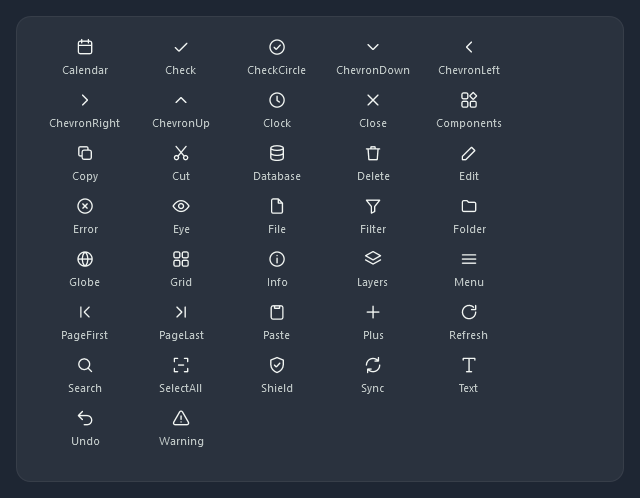
nc:StrokeIcon draws a line icon on a 24×24 grid with round ends, in its Foreground. The theme’s icons are the Nocturne.Icons.* geometries above (drawn for Nocturne, MIT); any path data in 24×24 units works too.
<nc:StrokeIcon Width="20" Height="20" Data="{StaticResource Nocturne.Icons.Folder}" />
<nc:StrokeIcon Width="16" Height="16" StrokeThickness="2" Data="M5,12 L19,12" />
| Property | |
|---|---|
Data | The outline in 24×24 units |
StrokeThickness | Line width in 24×24 units; it scales with the icon |
Foreground | The colour (inherited, so an icon in a button takes the button’s text colour) |
Templates with room for an icon read ControlHelper.Icon (menu items, AutoSuggestBox), so they take the same geometries.
NocturneIcon
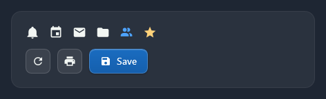
nc:NocturneIcon draws one of a set of Material Design Icons by Pictogrammers, filled, in its Foreground, 20×20 by default. Kind takes the icon’s name as MahApps’ IconBrowser shows it (view-grid is ViewGrid). Use these for an app’s own icons (navigation, commands, status); the line icons above stay for the theme’s templates.
<nc:NocturneIcon Kind="Bell" />
<nc:NocturneIcon Kind="AccountMultiple" Width="16" Height="16" Foreground="{DynamicResource Nocturne.Brushes.Accent.Light}" />
Two markup extensions, IconExtension and IconGeometryExtension, save the element around it:
| Markup | Gives | For |
|---|---|---|
{nc:Icon ContentSave} | a new NocturneIcon (Size=18 sets width and height) | Icon of a MenuItem or HamburgerMenuItem, Content of an icon button |
{nc:IconGeometry Star} | the icon’s frozen geometry in 24×24 units, filled | Data of a Path, a GeometryDrawing |
<Button Style="{StaticResource Nocturne.Styles.Button.Icon}" Content="{nc:Icon Refresh, Size=18}" ToolTip="Refresh" />
<MenuItem Header="Save" Icon="{nc:Icon ContentSave}" InputGestureText="Ctrl+S" />
<Path Width="20" Height="20" Stretch="Uniform" Data="{nc:IconGeometry Star}" Fill="{DynamicResource Nocturne.Brushes.Warning}" />
{nc:Icon} makes one element, and an element can only have one parent: in a Style setter, where one value is shared by every control, put a NocturneIcon in a template instead. Menu items scale an icon larger than their 16px slot down to fit.
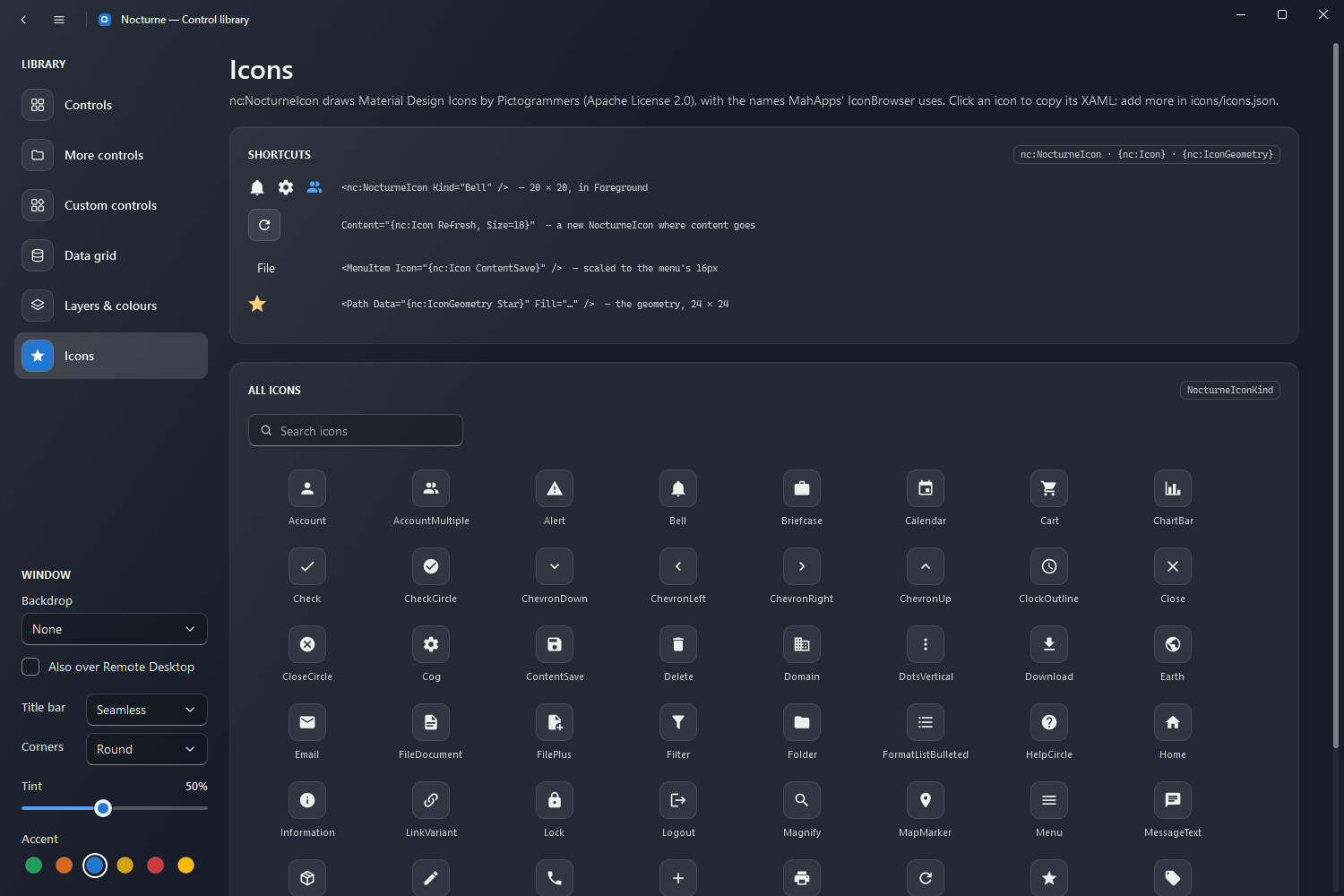
The demo’s Icons page shows every icon with its name; click one to copy its XAML. The set is listed in icons/icons.json in the repository; to add an icon, put its MDI name there and run python tools/generate_icons.py --fetch, which downloads the SVG and regenerates NocturneIconKind.
| Property | |
|---|---|
Kind | The icon (NocturneIconKind; None draws nothing) |
Data | Read-only: the icon’s geometry in 24×24 units (NocturneIcon.GeometryOf(kind) from code) |
Foreground | The colour (inherited) |
The icons are licensed under the Apache License 2.0, the rest of Nocturne under MIT; the package’s licence is MIT AND Apache-2.0 and it carries both licences and a NOTICE.md.