Text and input
Fields are dark, slightly sunken strips with a lighter bottom edge. In focus the bottom edge turns into an accent line; with an error the border turns red.
TextBox and Label
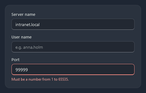
Label is the small text above a field; with Target its access key (_Server) moves focus to the field. ControlHelper.Placeholder shows a hint while the box is empty.
<Label Content="_Server name" Target="{Binding ElementName=ServerBox}" />
<TextBox x:Name="ServerBox" Text="{Binding ServerName}" />

<Label Content="_User name" Target="{Binding ElementName=UserBox}" />
<TextBox x:Name="UserBox" nc:ControlHelper.Placeholder="e.g. anna.holm" />
Errors
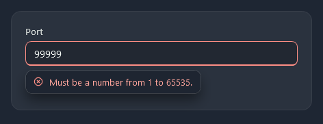
A validation error on the binding draws the field’s red frame, and a small callout under the field shows the first error message while the field has focus or the mouse is over it. It floats over the layout, so nothing moves when an error comes or goes:
<TextBox Text="{Binding Port, ValidatesOnDataErrors=True, UpdateSourceTrigger=PropertyChanged}" />
ControlHelper.HasError shows the red frame without a binding error; put the message under the field yourself with Nocturne.Styles.TextBlock.Error:
<TextBox Text="{Binding Port}" nc:ControlHelper.HasError="{Binding PortIsInvalid}" />
<TextBlock Style="{StaticResource Nocturne.Styles.TextBlock.Error}" Text="Must be a number from 1 to 65535." />
Both work the same on PasswordBox, ComboBox, DatePicker, NumericUpDown and the pickers. To leave the callout out, set Validation.ErrorTemplate to {DynamicResource Nocturne.Templates.NoErrorAdorner}.
Search box and clear button
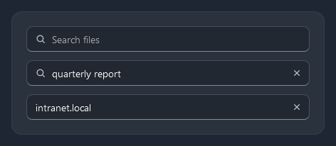
Nocturne.Styles.TextBox.Search puts a magnifier before the text. ControlHelper.ClearButton adds an × that shows while there is text and empties the box (any TextBox).
<TextBox Style="{StaticResource Nocturne.Styles.TextBox.Search}" Text="{Binding Query, UpdateSourceTrigger=PropertyChanged}"
         nc:ControlHelper.Placeholder="Search files" nc:ControlHelper.ClearButton="True" />
Multi-line text
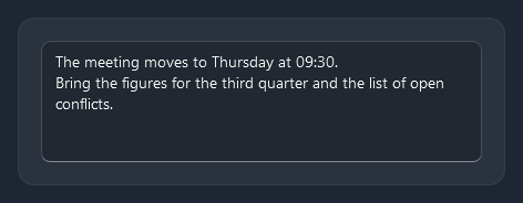
Nocturne.Styles.TextBox.MultiLine wraps, accepts Return and scrolls; give it a height.
<TextBox Style="{StaticResource Nocturne.Styles.TextBox.MultiLine}" Height="110" Text="{Binding Notes}" />
PasswordBox
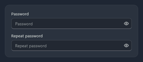
PasswordBox takes ControlHelper.Placeholder too. PasswordBoxHelper.CanReveal adds an eye button that shows the password as text while it is on.
<PasswordBox nc:PasswordBoxHelper.CanReveal="True" nc:ControlHelper.Placeholder="Password" />
RichTextBox
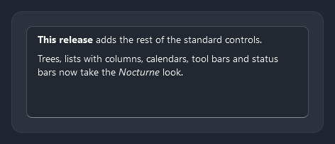
RichTextBox is a field like TextBox; its FlowDocument gets the theme font (a FlowDocument does not inherit the box’s font by itself).
<RichTextBox Height="150">
    <FlowDocument>
        <Paragraph><Bold>This release</Bold> adds the rest of the standard controls.</Paragraph>
    </FlowDocument>
</RichTextBox>
ComboBox
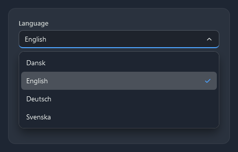
The drop-down is a dark popup with a shadow; the selected item has a light fill and a check mark.
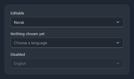
IsEditable="True" turns the field into a text box; ControlHelper.Placeholder shows while nothing is chosen.
<ComboBox ItemsSource="{Binding Languages}" SelectedItem="{Binding Language}" />
<ComboBox IsEditable="True" ItemsSource="{Binding Languages}" Text="{Binding LanguageText}" />
<ComboBox ItemsSource="{Binding Languages}" nc:ControlHelper.Placeholder="Choose a language" />
To type into a long list and filter it, use SearchComboBox.
NumericUpDown
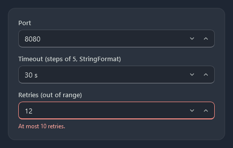
nc:NumericUpDown is a number field with down and up buttons; the arrow keys and the mouse wheel step it too. Typed text is parsed when focus leaves or on Return.
<nc:NumericUpDown Minimum="1" Maximum="65535" Value="{Binding Port}" />
<nc:NumericUpDown Minimum="0" Maximum="300" Interval="5" Value="{Binding Timeout}" StringFormat="0 's'" />
| Property | |
|---|---|
Value | The number (double?; empty is null), two-way by default |
Minimum, Maximum | The range; values outside are clamped |
Interval | The step of the buttons, arrow keys and wheel (1) |
StringFormat | How the value is shown, e.g. N1 or 0 'ms' (G) |
IsReadOnly | No typing and no stepping |
HideUpDownButtons | Leaves out the buttons |
ValueChanged | Raised when Value changes |
DatePicker
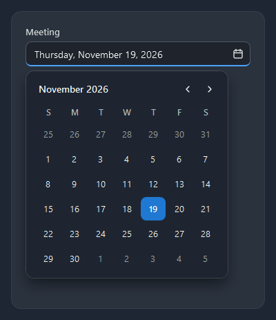
The calendar opens under the field. Today has a ring (IsTodayHighlighted), the selected day the accent.
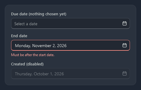
<DatePicker SelectedDate="{Binding Meeting}" />
<DatePicker SelectedDate="{Binding EndDate}" nc:ControlHelper.HasError="{Binding EndIsBeforeStart}" />
TimePicker
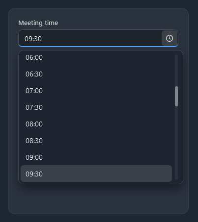
nc:TimePicker is a time field that opens a list of times MinuteStep minutes apart; the time can also be typed (9 or 9:30, taken on Return or when focus leaves). It takes the keyboard like a ComboBox: Alt+Down or F4 opens the list, the arrow keys move the highlight, Return takes the time and Escape closes the list.
<nc:TimePicker SelectedTime="{Binding MeetingTime}" MinuteStep="30" />
| Property | |
|---|---|
SelectedTime | The time (TimeSpan?), two-way by default |
MinuteStep | Minutes between the times in the list (15) |
IsDropDownOpen | Opens the list |
ColorPicker
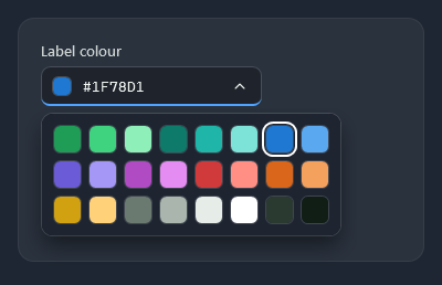
nc:ColorPicker shows the colour and its hex code and opens a grid of swatches. Space, Alt+Down or F4 opens it at the current colour, the arrow keys move through the swatches, Return, Space or Tab takes one and Escape closes the grid without a change; focus stays on the picker.
<nc:ColorPicker Width="200" SelectedColor="{Binding LabelColour}" />
| Property | |
|---|---|
SelectedColor | The colour, two-way by default |
Palette | The swatches (any list of Color); ColorPicker.DefaultPalette (24 colours) by default |
IsDropDownOpen | Opens the palette |
AutoSuggestBox
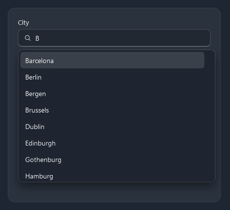
nc:AutoSuggestBox is a text box that suggests entries from ItemsSource that contain the typed text. Up and Down move through them, Return or a click takes one and raises SuggestionChosen. ControlHelper.Icon puts an icon before the text.
<nc:AutoSuggestBox ItemsSource="{Binding Cities}" Text="{Binding City}" nc:ControlHelper.Placeholder="Start typing a city"
                   nc:ControlHelper.Icon="{StaticResource Nocturne.Icons.Search}" SuggestionChosen="OnCityChosen" />
| Member | |
|---|---|
Text | The text in the box, two-way by default |
ItemsSource | The entries to suggest from (matched with ToString()) |
MaxSuggestions | How many suggestions show at most (8) |
SuggestionChosen | Raised when a suggestion is taken |
SearchComboBox
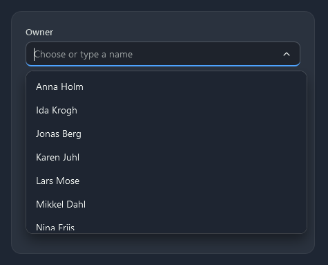
nc:SearchComboBox opens and picks like a ComboBox, but it can be typed into: the list filters to the items that match and the first match is completed. The first click or Tab into the box selects its text, so typing starts a new search. The list is virtualized, so thousands of items stay fast.
<nc:SearchComboBox ItemsSource="{Binding People}" DisplayMemberPath="Name" SelectedItem="{Binding Owner}"
                   nc:ControlHelper.Placeholder="Choose or type a name" />
| Property | |
|---|---|
ItemsSource, SelectedItem | The items and the chosen one |
SelectedValuePath, SelectedValue | A member of the chosen item, as on ComboBox |
DisplayMemberPath, ItemTemplate | The text shown and matched, and an optional template for the list |
FilterMode | Contains (every typed word appears somewhere, the default) or StartsWith |
IsFilteringEnabled | False keeps every item in the list and only highlights and completes (true) |
IsAutoCompleteEnabled | Fills in the rest of the first match, selected so the next key replaces it (true) |
OpenOnFocus | Opens the list when the box gets focus (true) |
MaxDropDownHeight | Height of the list (260) |
NoMatchesText | Shown when nothing matches (“No matches”) |