Selection
CheckBox
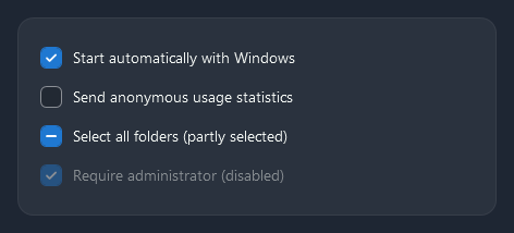
A checked box takes the accent with a check mark; IsThreeState adds the partly checked state (IsChecked="{x:Null}"), drawn as a dash.
<CheckBox Content="Start automatically with Windows" IsChecked="{Binding StartWithWindows}" />
<CheckBox Content="Select all folders" IsThreeState="True" IsChecked="{x:Null}" />
RadioButton
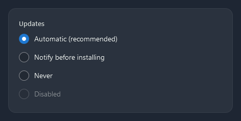
<TextBlock Style="{StaticResource Nocturne.Styles.TextBlock.Label}" Text="Updates" />
<RadioButton GroupName="Updates" Content="Automatic (recommended)" IsChecked="True" />
<RadioButton GroupName="Updates" Content="Notify before installing" />
<RadioButton GroupName="Updates" Content="Never" />
Toggle switch
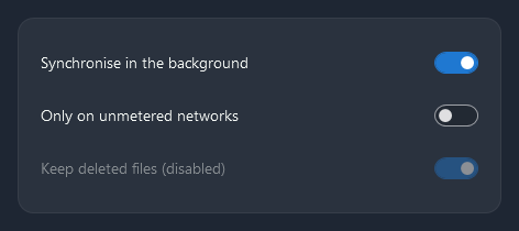
Nocturne.Styles.ToggleSwitch turns a CheckBox into a switch: the label on the left, the switch on the right, and the knob slides in 150 ms. Use it for settings that take effect at once.
<CheckBox Style="{StaticResource Nocturne.Styles.ToggleSwitch}" Content="Synchronise in the background"
          IsChecked="{Binding SyncInBackground}" />
The content can be any element, for example a label with its state under it:
<CheckBox Style="{StaticResource Nocturne.Styles.ToggleSwitch}" IsChecked="{Binding Metered}">
    <StackPanel>
        <TextBlock Text="Only on unmetered networks" />
        <TextBlock Style="{StaticResource Nocturne.Styles.TextBlock.Hint}" Text="Off" />
    </StackPanel>
</CheckBox>
Slider
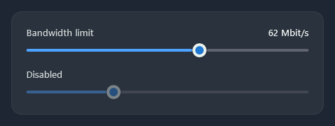
The track fills with the accent up to a round thumb.
<Slider Minimum="0" Maximum="100" Value="{Binding Bandwidth}" SmallChange="1" LargeChange="10" />
RangeSlider
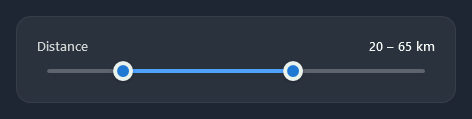
nc:RangeSlider has two thumbs for a lower and an upper value; the part between them is filled. Drag a thumb or use the arrow keys on the focused one; both thumbs are tab stops.
<nc:RangeSlider Minimum="0" Maximum="100" LowerValue="{Binding MinDistance}" UpperValue="{Binding MaxDistance}" SmallChange="5" />
| Property | |
|---|---|
Minimum, Maximum | The range (0 to 100) |
LowerValue, UpperValue | The two values, two-way by default; the lower never passes the upper |
SmallChange | The step of the arrow keys |
Rating
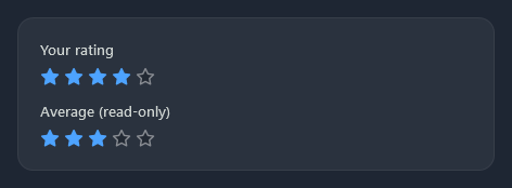
nc:Rating is a row of stars; click a star (or use the arrow keys) to set the value.
<nc:Rating Value="{Binding Stars}" />
<nc:Rating Value="3" IsReadOnly="True" Focusable="False" />
| Property | |
|---|---|
Value | The number of filled stars, two-way by default |
Maximum | The number of stars (5) |
IsReadOnly | Shows the value without taking clicks |