Lists and data
ListBox
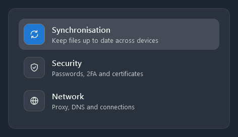
Items are rounded rows that light up under the mouse; the selected one gets a light fill. Lists have no border of their own: they sit on a card.
<ListBox SelectedIndex="0">
    <ListBoxItem>
        <StackPanel Orientation="Horizontal">
            <ContentControl Style="{StaticResource Nocturne.Styles.IconTile}">
                <nc:StrokeIcon Data="{StaticResource Nocturne.Icons.Sync}" />
            </ContentControl>
            <StackPanel Margin="14,0,0,0" VerticalAlignment="Center">
                <TextBlock Style="{StaticResource Nocturne.Styles.TextBlock.ListTitle}" Text="Synchronisation" />
                <TextBlock Style="{StaticResource Nocturne.Styles.TextBlock.Caption}" Text="Keep files up to date across devices" />
            </StackPanel>
        </StackPanel>
    </ListBoxItem>
</ListBox>
Side navigation
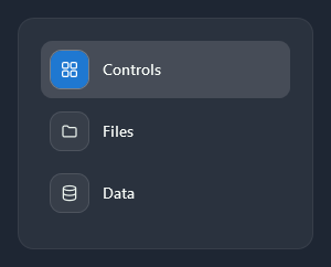
Nocturne.Styles.ListBox.Navigation is a list for the side bar of a window: an icon tile and a label per item, and the selected item’s icon tile fills with the accent.
<ListBox Style="{StaticResource Nocturne.Styles.ListBox.Navigation}" SelectedIndex="0">
    <ListBoxItem>
        <StackPanel Orientation="Horizontal">
            <ContentControl Style="{StaticResource Nocturne.Styles.IconTile.Small}">
                <nc:StrokeIcon Width="18" Height="18" Data="{StaticResource Nocturne.Icons.Grid}" />
            </ContentControl>
            <TextBlock Margin="12,0,0,0" VerticalAlignment="Center" Text="Controls" />
        </StackPanel>
    </ListBoxItem>
</ListBox>
For a navigation pane that folds to its icons and has groups, use HamburgerMenu.
ListView with GridView
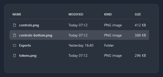
A ListView with a GridView gets small semibold column headers with a line under them, and rows like the ListBox.
<ListView ItemsSource="{Binding Files}">
    <ListView.View>
        <GridView>
            <GridViewColumn Header="NAME" Width="220" DisplayMemberBinding="{Binding Name}" />
            <GridViewColumn Header="MODIFIED" Width="140" DisplayMemberBinding="{Binding Modified}" />
            <GridViewColumn Header="SIZE" Width="80" DisplayMemberBinding="{Binding Size}" />
        </GridView>
    </ListView.View>
</ListView>
TreeView
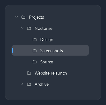
Each level is indented; a chevron opens and closes a branch, and the selected item has a short accent bar on the left.
<TreeView ItemsSource="{Binding Folders}">
    <TreeView.ItemTemplate>
        <HierarchicalDataTemplate ItemsSource="{Binding Children}">
            <TextBlock Text="{Binding Name}" />
        </HierarchicalDataTemplate>
    </TreeView.ItemTemplate>
</TreeView>
DataGrid
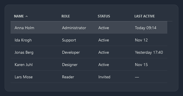
The standard DataGrid gets the column headers of the ListView, quiet row lines and the selected row’s light fill. Sorting shows a small chevron in the header.
<DataGrid ItemsSource="{Binding People}" AutoGenerateColumns="False" IsReadOnly="True">
    <DataGrid.Columns>
        <DataGridTextColumn Header="NAME" Width="*" Binding="{Binding Name}" />
        <DataGridTextColumn Header="ROLE" Width="*" Binding="{Binding Role}" />
    </DataGrid.Columns>
</DataGrid>
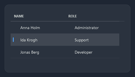
With HeadersVisibility="All" the rows get a row header, which marks the selected row with an accent bar.
NocturneGrid
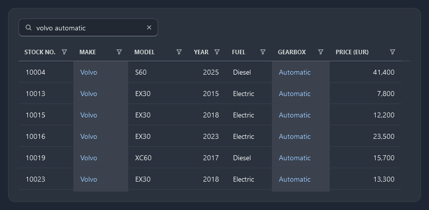
nc:NocturneGrid is a DataGrid for large lists. Rows and columns are virtualized and the rows are recycled, and the text of NocturneGridColumn cells is drawn straight from the font, so tens of thousands of rows scroll smoothly. It scrolls by row (a wheel turn moves three rows). While the scroll bar thumb is dragged, the rows in view show the rows at the thumb and the grid moves there when the thumb is released, so a fast drag keeps up.
- Search:
SearchTextfilters the rows to those that contain every word somewhere (in the searchable columns); quotes keep a phrase together. The hits are drawn in the light accent in faintly lit cells. - Filters: every column header has a funnel. Its filter lists the column’s values with their counts to tick, or takes typed values:
*matches any text (vol*), and numbers and dates take ranges (>50000,<=2019,2020-01-01..2020-06-30). A column of dates gets a tree of years, months and days. - Sorting: a click on a header sorts up, then down, then back to the original order.
- Grouping:
GroupMemberPathgroups the rows under header rows that fold up; the rows alternate within each group. - Copying: Ctrl+C copies the selected rows as the cells show them, with the binding’s format (
183,140,09/20/2015), unless the column has its ownClipboardContentBinding. - Paging:
PageSizeshows one page at a time with a pager under the rows.
<TextBox x:Name="Search" Style="{StaticResource Nocturne.Styles.TextBox.Search}" nc:ControlHelper.ClearButton="True" />
<nc:NocturneGrid ItemsSource="{Binding Cars}" SearchText="{Binding Text, ElementName=Search}" Filtered="OnFiltered">
    <nc:NocturneGrid.Columns>
        <nc:NocturneGridColumn Width="130" Header="MAKE" Binding="{Binding Make}" />
        <nc:NocturneGridColumn Width="150" Header="MODEL" Binding="{Binding Model}" />
        <nc:NocturneGridColumn Width="76" Header="YEAR" Binding="{Binding Year}" TextAlignment="Right" />
        <nc:NocturneGridColumn Width="136" Header="PRICE (EUR)" Binding="{Binding Price, StringFormat=N0}" IsSearchable="False" TextAlignment="Right" />
        <nc:NocturneGridCheckBoxColumn Width="88" Header="SOLD" Binding="{Binding IsSold}" />
    </nc:NocturneGrid.Columns>
</nc:NocturneGrid>
Header filters
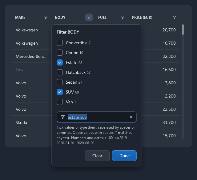
A column with at most FilterListLimit different values lists them to tick; with more, the values are typed. A column’s filter can be set from XAML or code with FilterText (FilterDates for dates). NocturneGrid.ClearFilterCommand clears one column’s filter (the column as parameter) or, without a parameter, the search and every filter.
<nc:NocturneGridColumn Header="BODY" Binding="{Binding Body}" FilterText="estate suv" />
<Button Content="Clear filters" Command="{x:Static nc:NocturneGrid.ClearFilterCommand}" CommandTarget="{Binding ElementName=Cars}" />
Groups
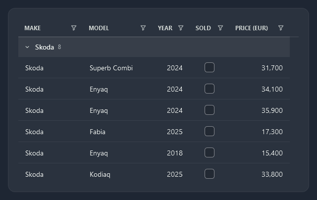
<nc:NocturneGrid ItemsSource="{Binding Cars}" GroupMemberPath="Make">
Pages
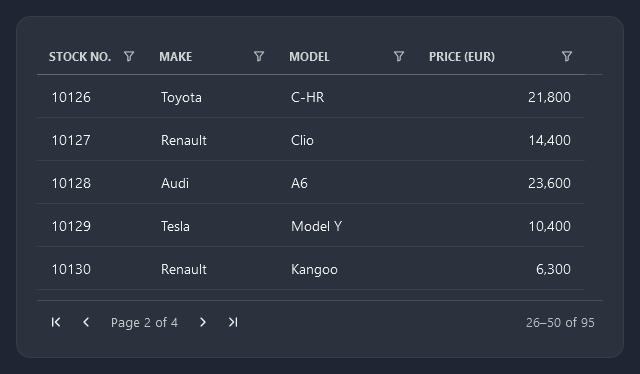
<nc:NocturneGrid ItemsSource="{Binding Cars}" PageSize="25">
Members
| Property | |
|---|---|
SearchText | Words that must all be found in a row; quotes keep a phrase together |
SearchDelay | Pause after the last change before the rows are filtered (zero filters at once) |
FilterListLimit | A filter lists the values to tick when the column has at most this many |
GroupMemberPath | Member the rows are grouped by; empty for none |
PageSize, PageIndex | Rows per page (0 shows every row) and the page shown, from 0 |
PageCount, PageNumber, PageFirstRow, PageLastRow, IsPaging | Read-only, for your own pager text |
FilteredItemCount, TotalItemCount, IsFiltered | Read-only counts, for a status line |
HighlightForeground, HighlightBrush, HighlightCellBackground | Colours of the search hits |
EnableLightweightTextRendering | Draws cell text as glyph runs (true); columns with an ElementStyle keep a TextBlock |
| Method or event | |
|---|---|
Filtered | Raised after the rows have been filtered; Count and TotalCount in the event data |
SelectedItemChanged | Raised when SelectedItem changes (not by combo boxes inside cells, unlike SelectionChanged) |
ApplyFilters() | Filters now instead of after SearchDelay, and re-reads changed values |
ClearFilters() | Clears the search and every column filter |
GetVisibleItems() | The rows left after the search and filters, in the order shown |
Columns are nc:NocturneGridColumn (text; TextAlignment instead of an ElementStyle) and nc:NocturneGridCheckBoxColumn (TrueText and FalseText name the values in the filter, the search and when copying; its search is off by default). Both take IsSearchable, IsFilterable, FilterMemberPath and FilterText; other DataGrid columns work too, and are searched through NocturneGrid.FilterMemberPath or their SortMemberPath.
Calendar
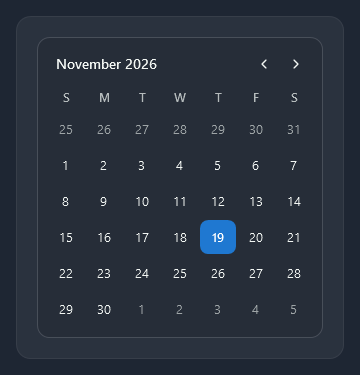
Month and year at the top left with arrows on the right; today has a ring and the selected day the accent. A click on the month shows the months of the year, and again the years.
<Calendar SelectedDate="{Binding Meeting}" />
ScrollViewer
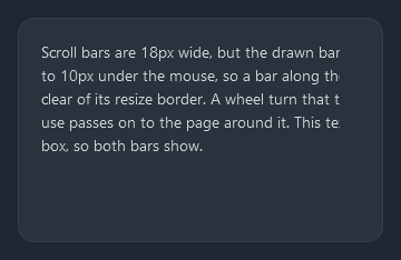
Scroll bars are thin 6px lines that widen to 10px under the mouse. Their hit area is 18px, so a bar along the window edge stays clear of the resize border. They fade out while the mouse is away and come back when it is over the scroll viewer or the content scrolls; their room stays, so the content does not move (ScrollViewerHelper.AutoHide). The pictures on these pages show no bars for that reason. The theme’s ScrollViewer passes a wheel turn it cannot use (a list scrolled to its end, or with nothing to scroll) on to the scroll viewer around it, so a list inside a scrolling page does not stop the page (ScrollViewerHelper).
<ScrollViewer HorizontalScrollBarVisibility="Auto">
    ...
</ScrollViewer>