Window and dialogs
NocturneWindow
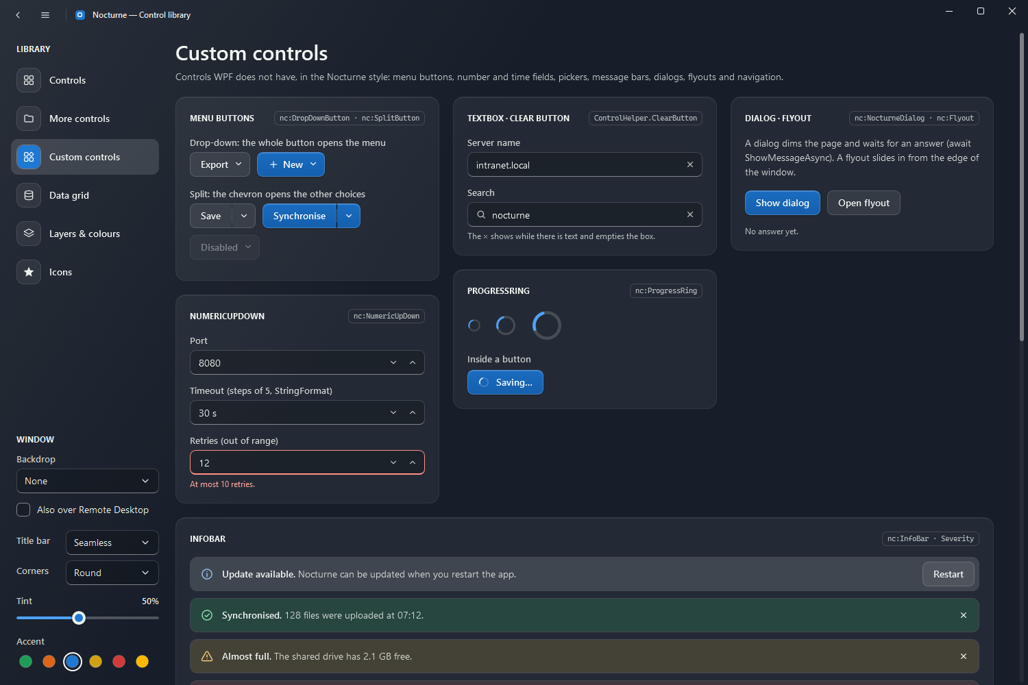
nc:NocturneWindow is the frame: the Windows 11 backdrop under a dark tint and the light from the top-left corner (Theme and accents), a 44px title bar with the title and its own minimise, maximise and close buttons, and the layers for flyouts and dialogs. The demo window has a back button and a navigation toggle in LeftWindowCommands. While a backdrop is active it extends the DWM frame over the whole window, so Windows draws the material behind all of it.
<nc:NocturneWindow x:Class="MyApp.MainWindow"
                   xmlns="http://schemas.microsoft.com/winfx/2006/xaml/presentation"
                   xmlns:x="http://schemas.microsoft.com/winfx/2006/xaml"
                   xmlns:nc="urn:nocturne-wpf"
                   Title="Files" Backdrop="Acrylic" TintOpacity="0.5">
    <nc:NocturneWindow.LeftWindowCommands>
        <Button Style="{StaticResource Nocturne.Styles.Button.Icon.Subtle}" ToolTip="Back" Command="NavigationCommands.BrowseBack">
            <nc:StrokeIcon Width="16" Height="16" Data="{StaticResource Nocturne.Icons.ChevronLeft}" />
        </Button>
    </nc:NocturneWindow.LeftWindowCommands>
    <nc:NocturneWindow.RightWindowCommands>
        <Button Style="{StaticResource Nocturne.Styles.Button.Icon.Subtle}" ToolTip="Settings" Click="OnSettings">
            <nc:StrokeIcon Width="16" Height="16" Data="{StaticResource Nocturne.Icons.Components}" />
        </Button>
    </nc:NocturneWindow.RightWindowCommands>
    <!-- content -->
</nc:NocturneWindow>
| Property | |
|---|---|
Backdrop | Acrylic (default), Mica, MicaAlt or None |
TintOpacity | How strongly the dark tint covers the backdrop, 0 to 1 (0.5) |
UseBackdropInRemoteSession | Keeps the backdrop over Remote Desktop (false: the window paints its opaque ground there) |
IsBackdropActive | Read-only: true while Windows draws the backdrop |
TitleBarHeight | Height of the title bar (44) |
ShowIcon | Shows Icon (or a small accent glyph when none is set) before the title (true) |
ShowMinButton, ShowMaxRestoreButton | Hide the minimise or maximise button |
LeftWindowCommands | Content at the start of the title bar, before the icon and title (back, a navigation toggle), with a thin divider after it |
RightWindowCommands | Content in the title bar before the caption buttons (a badge goes on the button’s icon, so it stays inside the window) |
TitleBarStyle | Seamless (default), Separated or Accent, see below |
CornerStyle | Round (default, 8px), RoundSmall (4px, for small tool windows) or Square; Windows 11 draws the corners, a maximised window is always square |
Flyouts | The layer for flyouts, above the content and under the title bar |
Title bar styles
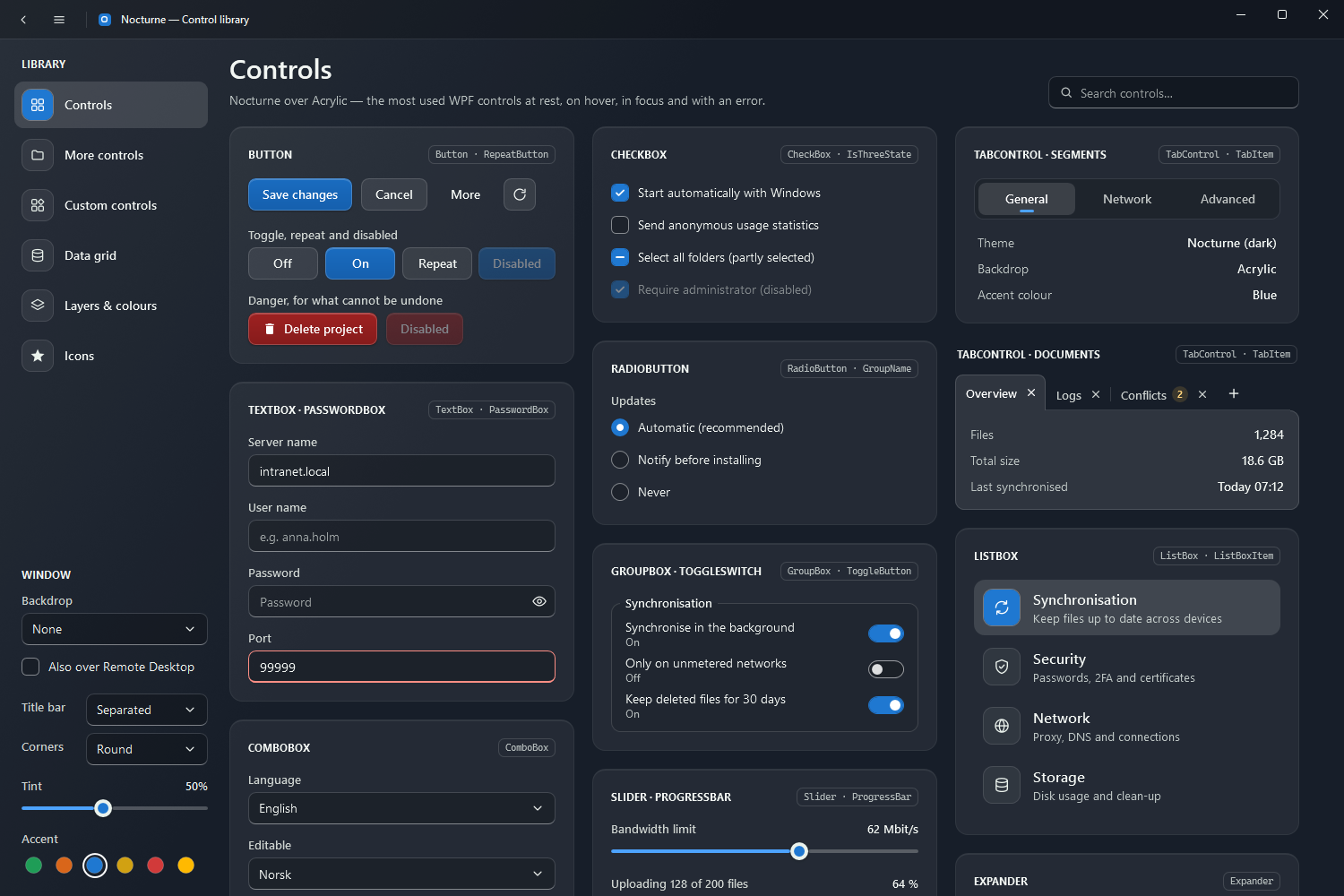
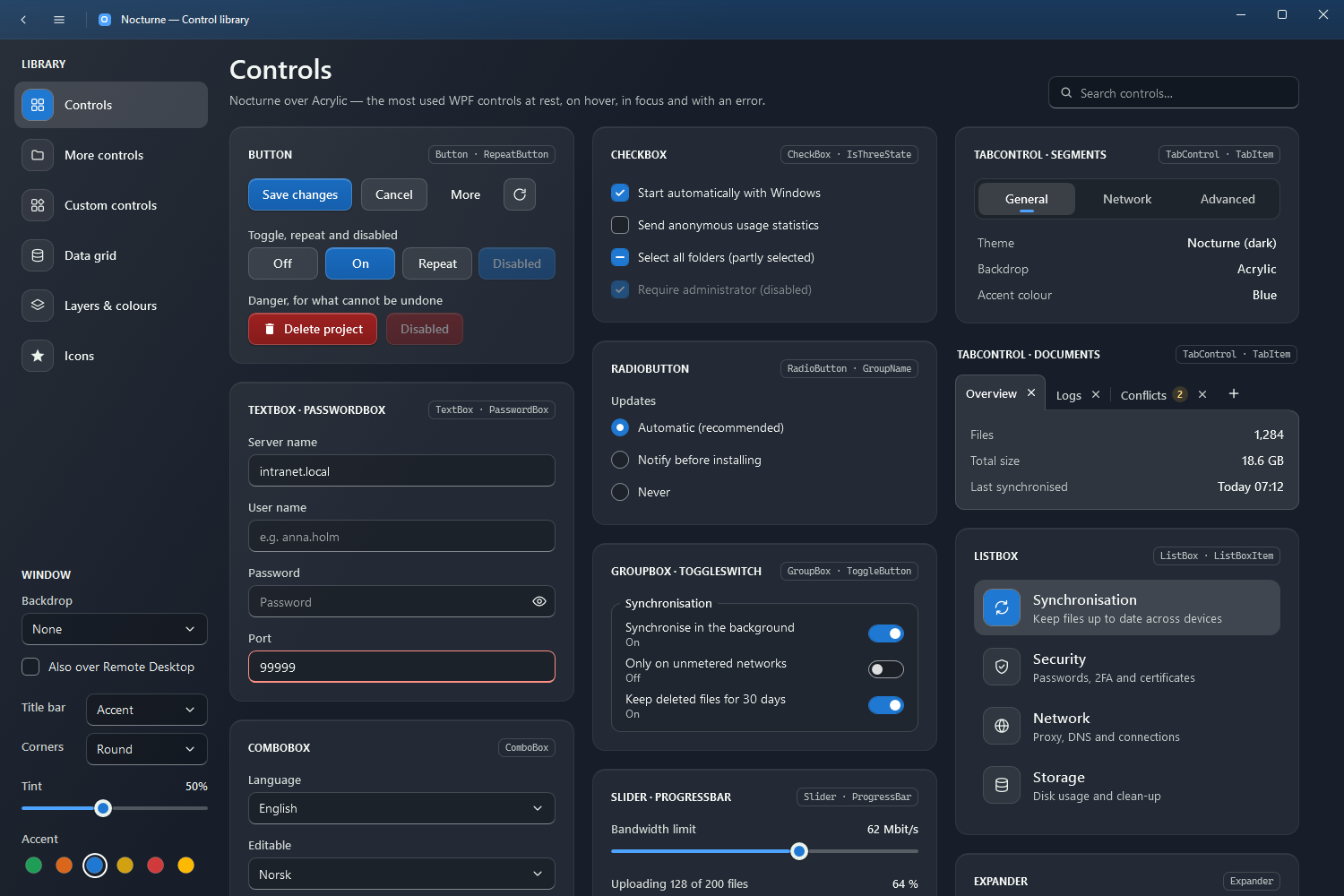
By default the title bar lies on the window’s own ground, one with the content (Seamless). Separated puts a slightly darker strip with a hairline under it, for apps with busy content at the top; Accent tints the strip with the accent colour, so it follows NocturneTheme.SetAccent.
<nc:NocturneWindow Title="Files" TitleBarStyle="Separated" CornerStyle="RoundSmall">
Dialogs
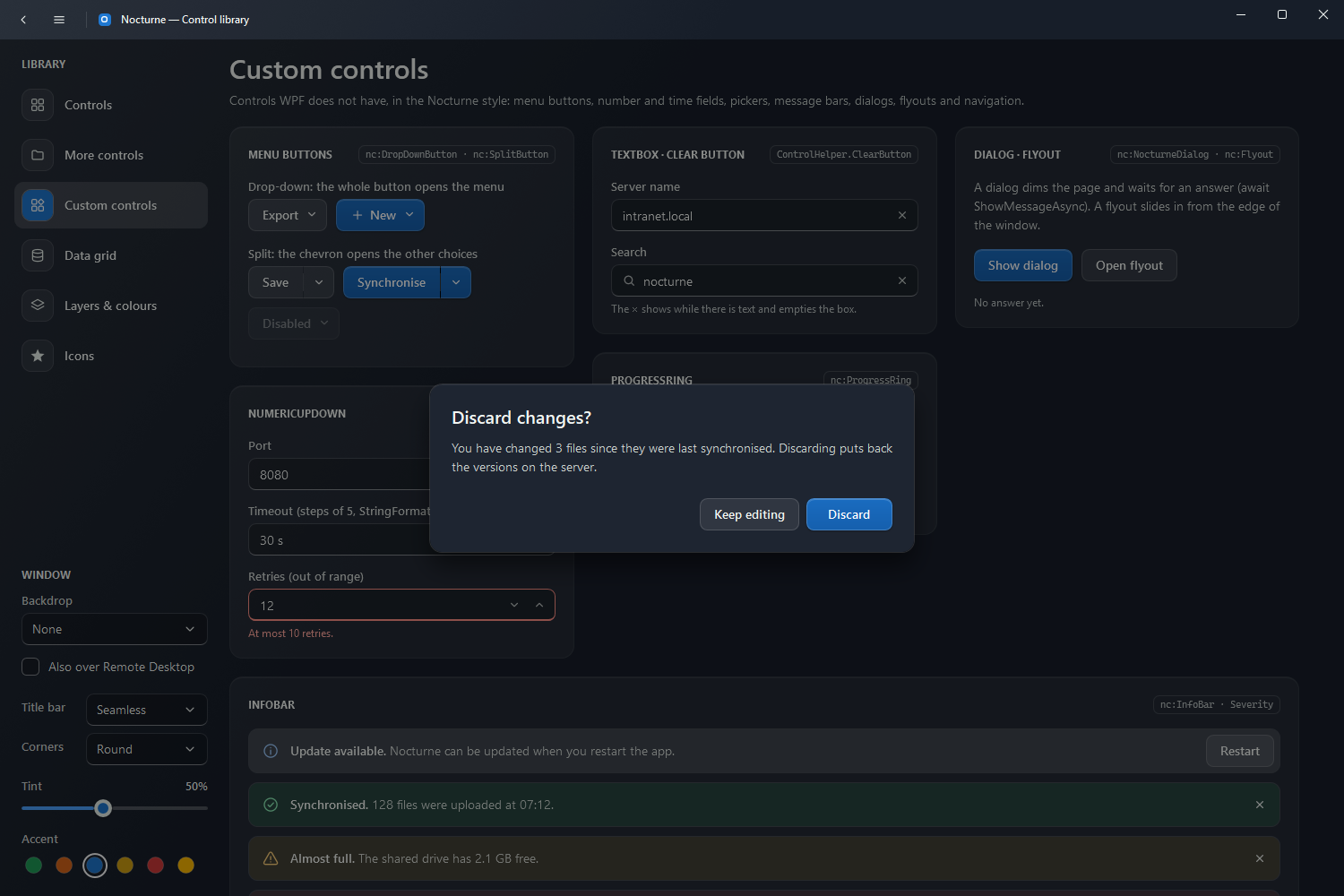
A dialog is drawn inside the window: the content dims, the dialog card sits in the middle, and the call waits for the answer. Focus goes back where it was when it closes; Escape cancels.
var answer = await ShowMessageAsync("Discard changes?",
    "You have changed 3 files since they were last synchronised.", "Discard", "Keep editing");
if (answer == MessageDialogResult.Affirmative)
{
    Discard();
}
ShowMessageAsync(title, message, affirmativeText = "OK", negativeText = null) shows one button, or two when negativeText is given. For your own content, create a nc:NocturneDialog and show it with ShowDialogAsync:
var dialog = new NocturneDialog
{
    Title = "Rename folder",
    Content = new TextBox { Text = folder.Name },
    AffirmativeText = "Rename",
    NegativeText = "Cancel",
};
if (await ShowDialogAsync(dialog) == MessageDialogResult.Affirmative) { ... }
NocturneDialog | |
|---|---|
Title | The heading |
Content | Text or any element under the heading |
AffirmativeText | Text of the primary button |
NegativeText | Text of the second button; hidden while null |
AffirmativeButtonStyle | Style of the main button (Nocturne.Styles.Button.Primary when null) |
Close(result) | Closes the dialog from code with Affirmative, Negative or Canceled |
Flyout
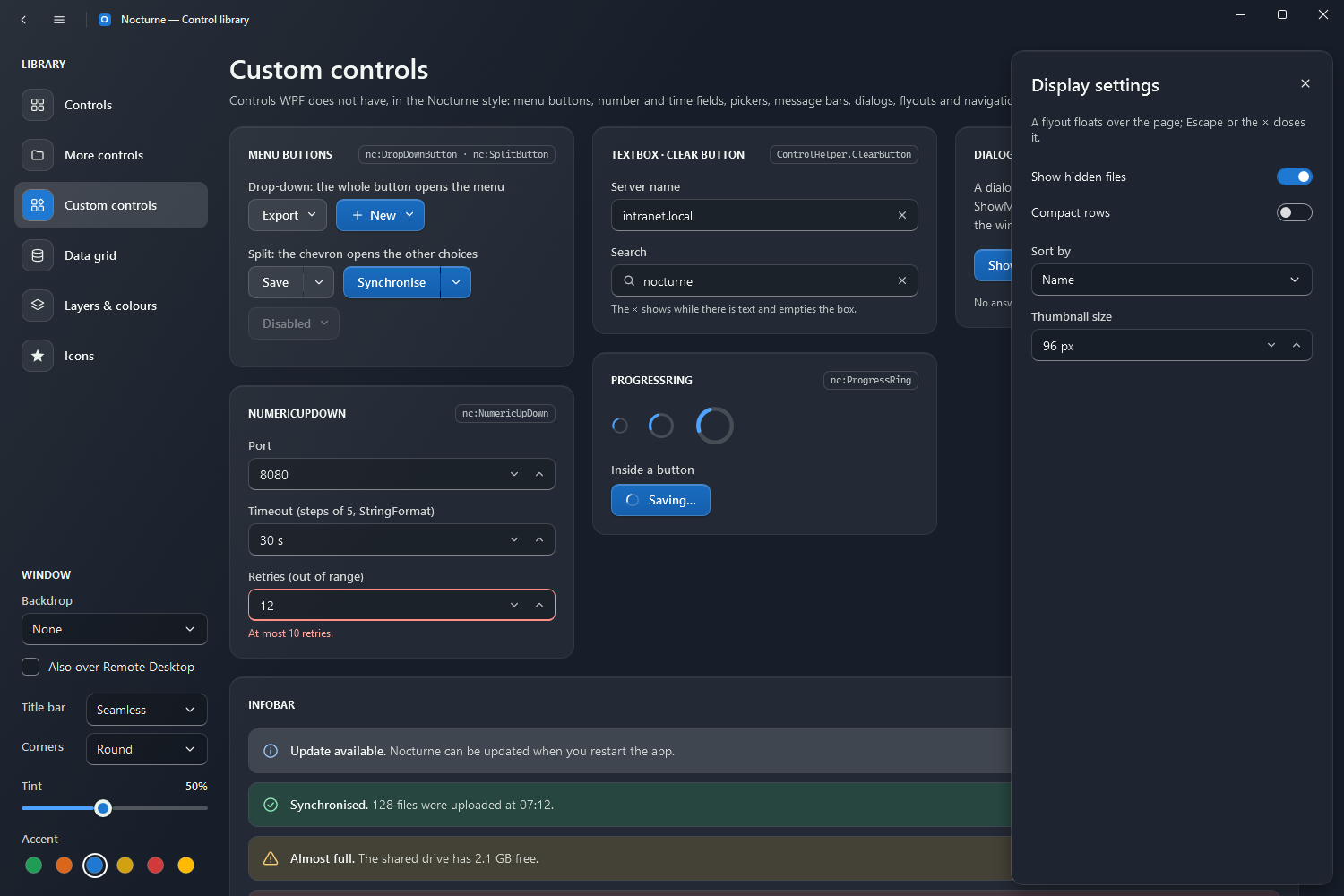
nc:Flyout is a panel that slides in from an edge of the window (220 ms) and floats over the page. It slides even when Windows’ animation effects are off (as in most Remote Desktop sessions). On opening it moves keyboard focus to its first field, and on closing gives it back to where it was. Put flyouts in the window’s Flyouts layer and open them with IsOpen:
<nc:NocturneWindow.Flyouts>
    <Grid>
        <nc:Flyout x:Name="SettingsFlyout" Header="Display settings" Width="360">
            <StackPanel>
                <CheckBox Style="{StaticResource Nocturne.Styles.ToggleSwitch}" Content="Show hidden files" />
            </StackPanel>
        </nc:Flyout>
    </Grid>
</nc:NocturneWindow.Flyouts>
SettingsFlyout.IsOpen = true;
| Property | |
|---|---|
Header | The heading |
IsOpen | Slides the flyout in or out |
Position | Right (default), Left, Top or Bottom |
IsClosable | Shows the × button and closes on Escape (true) |
IsAutoCloseEnabled | Closes AutoCloseInterval ms after opening (5000); the timer waits while the mouse is over the flyout |