Progress and status
ProgressBar
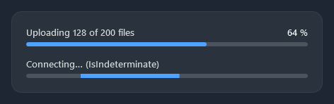
A thin track that fills with the accent. IsIndeterminate sends a short accent bar along it, for work of unknown length.
<ProgressBar Value="{Binding Uploaded}" Maximum="{Binding Total}" />
<ProgressBar IsIndeterminate="True" />
ProgressRing

nc:ProgressRing is a spinning ring for work of unknown length; it is hidden while IsActive is false. A quarter arc runs round a faint track once a second. It takes its size from Width and Height (32 by default) and its colours from Foreground (the light accent) and Background (the track), so it also fits inside a button.
<nc:ProgressRing IsActive="{Binding IsLoading}" />
<Button Style="{StaticResource Nocturne.Styles.Button.Primary}">
    <StackPanel Orientation="Horizontal">
        <nc:ProgressRing Width="16" Height="16" Margin="0,0,10,0" Foreground="{DynamicResource Nocturne.Brushes.Text.OnAccent}" Background="#33FFFFFF" />
        <TextBlock Text="Saving…" />
    </StackPanel>
</Button>
BusyIndicator
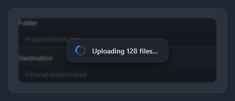
nc:BusyIndicator blurs and dims its content while IsBusy is true and shows a small card with a progress ring and BusyContent over it.
<nc:BusyIndicator IsBusy="{Binding IsUploading}" BusyContent="Uploading 128 files…">
    <StackPanel>...</StackPanel>
</nc:BusyIndicator>
| Property | |
|---|---|
IsBusy | Shows the busy card over the content |
BusyContent | Text or content on the card |
BlurRadius | Blur of the content while busy (4); 0 turns the blur off |
InfoBar
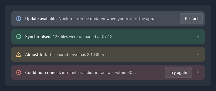
nc:InfoBar is a message bar across the page: an icon and a tint for its Severity, a bold Title, the Message, an optional action (the content) and a close button.
<nc:InfoBar Severity="Warning" Title="Almost full." Message="The shared drive has 2.1 GB free." />
<nc:InfoBar Severity="Error" Title="Could not connect." Message="intranet.local did not answer within 30 s.">
    <Button Content="Try again" Command="{Binding Reconnect}" />
</nc:InfoBar>
| Property | |
|---|---|
Severity | Info (default), Success, Warning or Error |
Title, Message | The bold title and the text after it |
Content | An action on the right, usually a button |
IsOpen | The bar is collapsed while false; the close button sets it |
IsClosable | Shows the close button (true) |
Closed | Raised when the close button closes the bar |