Navigation and layout
TabControl
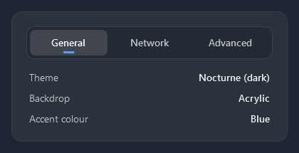
The implicit TabControl is a segmented control: the tab headers share one sunken strip, the selected one is a raised segment with a short accent line under its text, and the page sits below. When another tab is chosen, the segment glides over to it (320 ms) and the line runs ahead and stretches before it settles; nc:TabSelectionIndicator in the template draws both.
<TabControl>
    <TabItem Header="General">...</TabItem>
    <TabItem Header="Network">...</TabItem>
    <TabItem Header="Advanced">...</TabItem>
</TabControl>
Document tabs
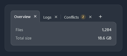
Nocturne.Styles.TabControl.Document is a row of tabs for open documents: the selected tab joins the panel under it, thin lines divide the others, and TabHelper adds close buttons, badges and a “+” button.
<TabControl Style="{StaticResource Nocturne.Styles.TabControl.Document}" ItemsSource="{Binding Documents}"
            nc:TabHelper.ShowCloseButton="True" nc:TabHelper.ShowAddButton="True">
    <TabControl.CommandBindings>
        <CommandBinding Command="{x:Static nc:TabHelper.AddTabCommand}" Executed="OnAddTab" />
    </TabControl.CommandBindings>
</TabControl>
The × runs TabHelper.CloseTabCommand, which raises TabHelper.TabClosing (set Cancel to keep the tab) and then removes the tab, or its item from ItemsSource when that is a writable list. TabHelper.Badge on a TabItem shows a small amber count after its header.
HamburgerMenu
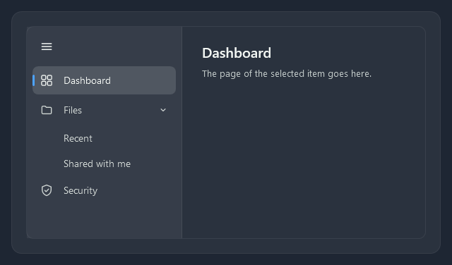
nc:HamburgerMenu is a navigation pane on the left and a content area on the right. Items are nc:HamburgerMenuItems with an Icon; an item with sub-items is a group that opens and closes (two levels). The selected item gets a light fill and a short accent bar.
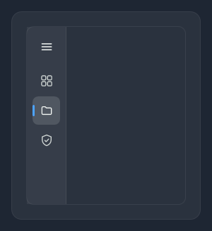
The ☰ button folds the pane to its icons (IsPaneOpen); a group then shows the selection of its sub-items.
<nc:HamburgerMenu SelectedIndex="0" Content="{Binding SelectedItem.Tag, RelativeSource={RelativeSource Self}}">
    <nc:HamburgerMenuItem Content="Dashboard" Tag="{StaticResource DashboardPage}">
        <nc:HamburgerMenuItem.Icon><nc:StrokeIcon Data="{StaticResource Nocturne.Icons.Grid}" /></nc:HamburgerMenuItem.Icon>
    </nc:HamburgerMenuItem>
    <nc:HamburgerMenuItem Content="Files" IsExpanded="True">
        <nc:HamburgerMenuItem.Icon><nc:StrokeIcon Data="{StaticResource Nocturne.Icons.Folder}" /></nc:HamburgerMenuItem.Icon>
        <nc:HamburgerMenuItem.Items>
            <nc:HamburgerMenuItem Content="Recent" />
            <nc:HamburgerMenuItem Content="Shared with me" />
        </nc:HamburgerMenuItem.Items>
    </nc:HamburgerMenuItem>
</nc:HamburgerMenu>
HamburgerMenu | |
|---|---|
Content, ContentTemplate | What the content area shows; usually bound to the selected item |
IsPaneOpen | False shows only the icons (true) |
PaneWidth, CompactPaneWidth | Width of the open pane (170) and of the icon column (40) |
SelectedItem | The selected page, on either level (a group itself is never selected) |
HamburgerMenuItem | |
|---|---|
Icon | The icon, usually an nc:StrokeIcon or {nc:Icon …} (NocturneIcon) |
Items | Sub-items: they make the item a group. Sub-items show no icon |
IsExpanded | Whether a group shows its sub-items; selecting a sub-item opens its group |
Expander
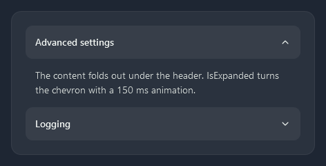
A 48px header with a chevron that turns in 150 ms; the content folds out under it.
<Expander Header="Advanced settings" IsExpanded="True">
    <TextBlock TextWrapping="Wrap" Text="..." />
</Expander>
Accordion
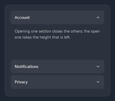
nc:Accordion is a stack of expanders where opening one closes the others; the open one takes the height that is left. Give it a height.
<nc:Accordion Height="330">
    <Expander Header="Account" IsExpanded="True">...</Expander>
    <Expander Header="Notifications">...</Expander>
    <Expander Header="Privacy">...</Expander>
</nc:Accordion>
GroupBox
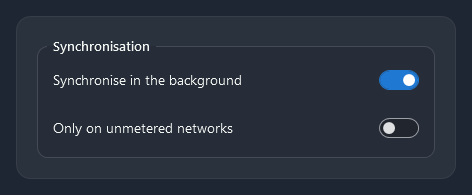
A thin rounded frame with the header set into its top edge.
<GroupBox Header="Synchronisation">
    <StackPanel>...</StackPanel>
</GroupBox>
For a section of a page, a card is usually the better choice.
Menu
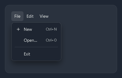
The menu bar’s items are flat until hovered; submenus open in the dark popup. ControlHelper.Icon puts a line icon before a menu item (or Icon="{nc:Icon ContentSave}" a Material Design icon, scaled to 16px), and InputGestureText shows its shortcut on the right.
<Menu>
    <MenuItem Header="_File">
        <MenuItem Header="_New" InputGestureText="Ctrl+N" nc:ControlHelper.Icon="{StaticResource Nocturne.Icons.Plus}" />
        <MenuItem Header="_Open…" InputGestureText="Ctrl+O" />
        <Separator />
        <MenuItem Header="E_xit" />
    </MenuItem>
</Menu>
ContextMenu
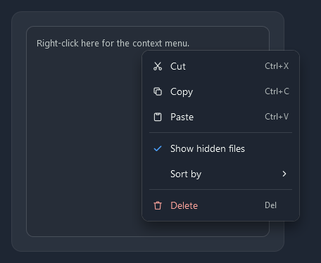
The same items as the menu: icons, shortcuts, check marks for IsCheckable items and submenus.
<Border.ContextMenu>
    <ContextMenu>
        <MenuItem Header="Cut" InputGestureText="Ctrl+X" nc:ControlHelper.Icon="{StaticResource Nocturne.Icons.Cut}" />
        <MenuItem Header="Show hidden files" IsCheckable="True" IsChecked="True" />
        <Separator />
        <MenuItem Header="Delete" InputGestureText="Del" Foreground="{DynamicResource Nocturne.Brushes.Error.Text}"
                  nc:ControlHelper.Icon="{StaticResource Nocturne.Icons.Delete}" />
    </ContextMenu>
</Border.ContextMenu>
The text menu
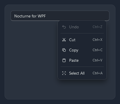
Text fields (TextBox, RichTextBox, the editable ComboBox, NumericUpDown, DatePicker) get Nocturne.ContextMenu.Text instead of Windows’ plain menu: Undo, Cut, Copy, Paste and Select all with the theme’s line icons and their shortcuts. The commands work on the field the menu was opened on, so Cut and Copy are dimmed while nothing is selected. A read-only field shows only Copy and Select all, and a PasswordBox gets Nocturne.ContextMenu.Password with Paste only. A field with SpellCheck.IsEnabled keeps WPF’s own menu, which lists the spelling suggestions.
To add an item, give the field a menu of your own (every field needs its own instance) with ContextMenuHelper.TargetsPlacement, and the commands go to the field:
<TextBox>
    <TextBox.ContextMenu>
        <ContextMenu nc:ContextMenuHelper.TargetsPlacement="True">
            <MenuItem Command="ApplicationCommands.Copy" nc:ControlHelper.Icon="{StaticResource Nocturne.Icons.Copy}" />
            <MenuItem Header="Copy as link" Click="OnCopyLink" />
        </ContextMenu>
    </TextBox.ContextMenu>
</TextBox>
ToolBar

A rounded strip with a dotted grip; buttons in it are flat until hovered, and items that do not fit go into the overflow menu behind a chevron. Buttons, toggle buttons, check boxes, combo boxes and text boxes in a tool bar get tool bar versions of their styles.
<ToolBarTray>
    <ToolBar>
        <Button ToolTip="Refresh"><nc:StrokeIcon Width="16" Height="16" Data="{StaticResource Nocturne.Icons.Refresh}" /></Button>
        <Separator />
        <ToggleButton Content="Details" IsChecked="True" />
        <ComboBox Width="130" SelectedIndex="0">...</ComboBox>
    </ToolBar>
</ToolBarTray>
StatusBar

<StatusBar>
    <StatusBarItem Content="7 items" />
    <Separator />
    <StatusBarItem Content="1 selected · 388 KB" />
    <StatusBarItem HorizontalAlignment="Right" Content="Synchronised today 07:12" />
</StatusBar>
GridSplitter
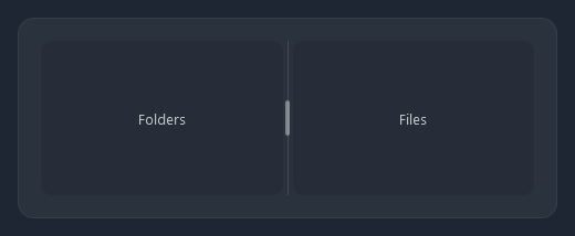
A thin line with a small grip in the middle that lights up under the mouse; the preview while dragging is the same line.
<GridSplitter Grid.Column="1" HorizontalAlignment="Stretch" />
ToolTip
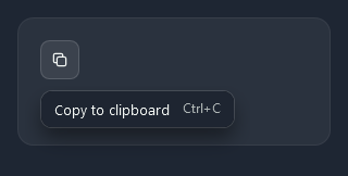
Tool tips use the popup ground with a small shadow.
<Button Style="{StaticResource Nocturne.Styles.Button.Icon}" ToolTip="Copy to clipboard">...</Button>
A tool tip can hold any content, for example its shortcut in Nocturne.Brushes.Shortcut:
<Button.ToolTip>
    <StackPanel Orientation="Horizontal">
        <TextBlock Text="Copy to clipboard" />
        <TextBlock Margin="12,0,0,0" Foreground="{DynamicResource Nocturne.Brushes.Shortcut}" Text="Ctrl+C" />
    </StackPanel>
</Button.ToolTip>