Theme and accents
The layers of a window
A NocturneWindow is built in layers, from the bottom up:
- The backdrop: the Windows 11 material behind the window (
Backdrop):Acrylic(the default),Mica,MicaAltorNone. - The tint:
Nocturne.Brushes.Window.Tint, a dark shade of the accent’s hue (a dark blue by default), over the backdrop atTintOpacity(0.5 by default). Higher values make the window darker and calmer; lower values let more of the desktop through. - The light: a soft white light from the top-left corner, 8 % at the corner and gone at 38 % of the diagonal. It is drawn dithered, pixel by pixel, so it has no visible steps (a plain gradient that faint shows diagonal bands, worst over Remote Desktop), and it is redrawn 150 ms after a resize.
- The surfaces: cards (
Nocturne.Brushes.Surface1), fields, buttons and lists areSolidColorBrushes with alpha. There is no blur inside the window.
<nc:NocturneWindow Backdrop="Mica" TintOpacity="0.65" ... />
The backdrop needs Windows 11 22H2 or later with transparency effects on (Settings, Personalisation, Colours). Without it, or with Backdrop="None", the window paints Nocturne.Brushes.Window.Fallback, an opaque ground of the same colour as tint over backdrop, and IsBackdropActive is false. The window switches between the two by itself when the user turns transparency effects on or off.
Over Remote Desktop the window paints the opaque ground too: WPF draws in software in a remote session, and a see-through window is slow there. It follows the session when it moves between the local screen and Remote Desktop while the app runs. Set UseBackdropInRemoteSession="True" to keep the backdrop anyway.
Accents
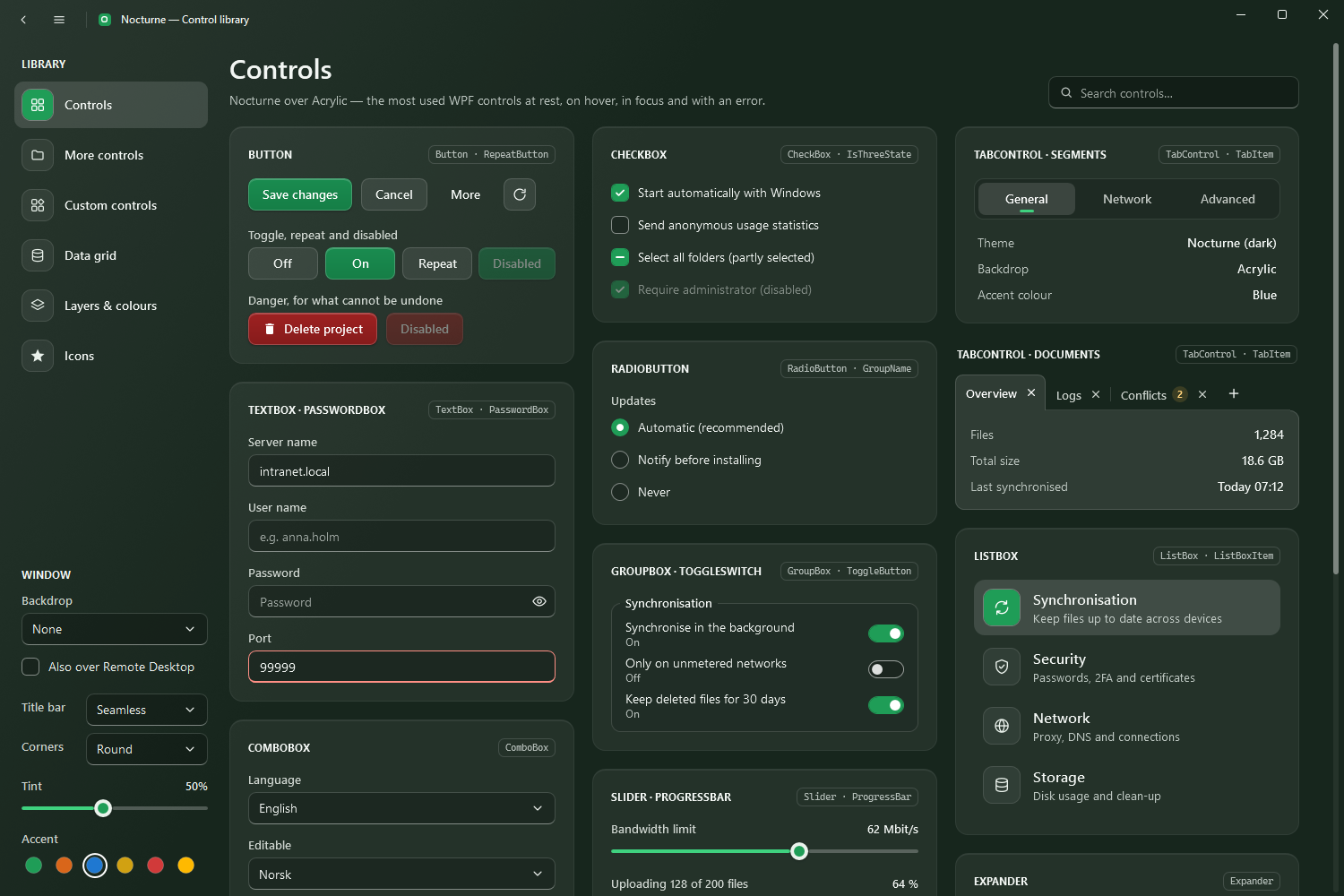
The accent is blue. NocturneTheme.SetAccent switches it at run time: the accent brushes, the text on the accent, the primary button, the popup ground, the window’s tint and fallback ground and the Accent title bar all take the new hue. Every style uses DynamicResource, so open windows follow at once.
using Nocturne.Wpf.Controls;

NocturneTheme.SetAccent(NocturneAccent.Blue);
NocturneAccent | |
|---|---|
Green | Meadow green, the colour of the original design |
Orange | |
Blue | The default |
Yellow | Gold; text on it is dark, as white on yellow is hard to read |
Red | |
System | The accent colour chosen in Windows (Settings, Personalisation, Colours), followed while the app runs; blue where Windows has none |
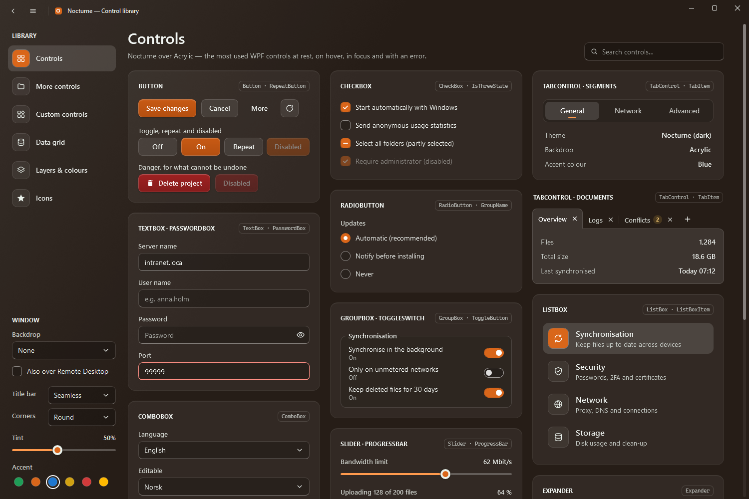
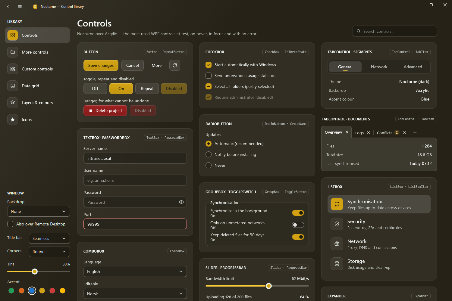
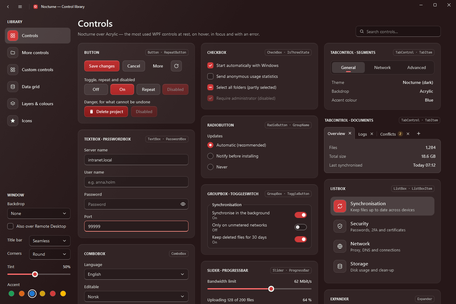
System reads the seven shades Windows derives from the user’s colour, takes the window’s tint from its hue and picks white or dark text on the accent by its brightness. A NocturneWindow listens for Windows’ colour changes, so the app follows when the user picks another colour.
| Member | |
|---|---|
SetAccent(accent, resources = null) | Writes the brushes into resources, by default Application.Current.Resources (where they override the ones in Nocturne.xaml) |
Accent | The accent last set |
AccentChanged | Raised after the brushes have been replaced (also when the Windows accent changes under System) |
GetSystemAccent() | The Windows accent colour, or null where Windows has none |
SystemAccentChanged | Raised when the Windows accent changes, whichever accent the app uses |
If you add brushes of your own in the accent colour, reference Nocturne.Brushes.Accent, Nocturne.Brushes.Accent.Light or Nocturne.Brushes.Accent.Text with DynamicResource, and they follow too.
Overriding a colour
Every colour is a resource key (Resource keys). Redefine one in App.xaml, after the merged dictionary, to change it app-wide:
<Application.Resources>
    <ResourceDictionary>
        <ResourceDictionary.MergedDictionaries>
            <ResourceDictionary Source="pack://application:,,,/Nocturne.Wpf;component/Styles/Nocturne.xaml" />
        </ResourceDictionary.MergedDictionaries>
        <SolidColorBrush x:Key="Nocturne.Brushes.Error" Color="#FFFF6F66" />
    </ResourceDictionary>
</Application.Resources>
The accent brushes are the exception: SetAccent rewrites them, so pick an accent instead.
Font
The theme uses Segoe UI, and Cascadia Mono (or Consolas) for monospaced text; both come with Windows, so nothing is bundled. To use another font, redefine Nocturne.Fonts.Family (and Nocturne.Fonts.Family.Mono for the monospaced text):
<FontFamily x:Key="Nocturne.Fonts.Family">Inter, Segoe UI</FontFamily>
The type scale (Nocturne.Font.Size.*) and the text styles are on Typography and surfaces.
Focus
Keyboard focus shows as a 2px white ring a little outside the control (Nocturne.Styles.FocusVisual, in Nocturne.Brushes.Focus), only when focus came from the keyboard. Templates that cannot use a FocusVisualStyle (a tree item would ring its whole subtree) draw their own ring with FocusHelper.